Interface do usuário do desenvolvedor
General overview
Quarkus Dev UI is a developer-friendly user interface that comes to life when you run your application in development mode (./mvnw quarkus:dev).
It serves as a powerful portal for exploring, debugging, and interacting with your application - all while it’s running - with zero code changes or restarts.
What is Dev UI?
The Dev UI is designed to boost developer joy by making Quarkus' inner workings observable and extensible. It offers:
-
Insight into available extensions and their capabilities
-
Access to runtime metadata and tools
-
A responsive frontend that integrates tightly with hot reload
-
A flexible way for extensions to expose configuration, documentation, and actions
Whether you’re a developer exploring your project or an extension author enhancing the experience, Dev UI is your entry point.
Layout at a Glance
When running in dev mode, Quarkus provides a dynamic, modular web interface accessible at http://localhost:8080/q/dev-ui. You can also click d in the console log, that will open your default browser at Dev UI.
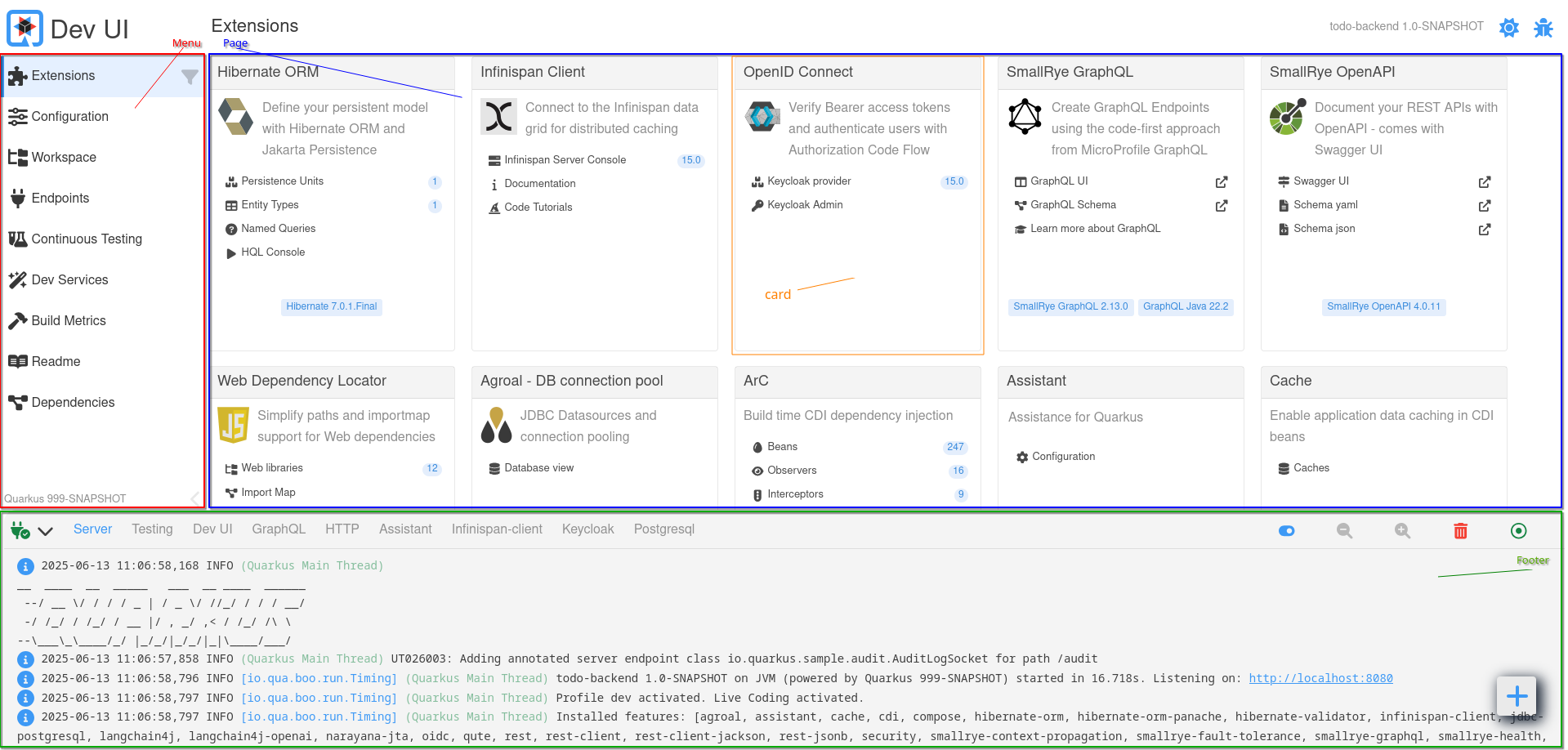
The basic layout has the following parts:
-
Menu
-
Page
-
Footer
-
Card
-
Settings
Below is a visual overview of the layout:
Menu (Left Sidebar)
The menu on the left-hand side provides structured access to built-in pages:
| Menu Item | Descrição |
|---|---|
Extensions |
Displays all Quarkus extensions (used by the current application) as cards. Each card may provide configuration, documentation, or tools. |
Configuration |
Shows all configuration options (with current, default, and documentation info). Includes a config editor (text & form modes). |
Workspace |
A project file browser. Files can be opened and edited inline. Extensions may add workspace actions. |
Endpoints |
Lists all HTTP endpoints (REST, GraphQL, internal, etc.). Helps you inspect available routes in your app. |
Continuous Testing |
Monitors and controls continuous testing. View test results, rerun tests, or toggle testing state. |
Dev Services |
Displays information about automatically started services (e.g., databases, Kafka brokers). |
Build Metrics |
Provides performance metrics from the last build and reload cycle. |
Readme |
Renders your project’s |
Dependencies |
Shows all runtime and deployment dependencies with dependency path exploration and search functionality. |
| You can drag a page from an extension card into the menu to bookmark it for quick access. |
Page Area (Main Content)
The main panel displays content for the selected menu item or extension. Depending on the selected page, it may render:
-
Extension-specific tools and UIs (e.g., GraphQL UI, Swagger UI)
-
JSON viewers, code editors, or metrics charts
-
Interactive actions (e.g., buttons, toggles)
-
Documentation and links
Pages are modular and dynamically loaded. Extensions can contribute custom pages written using Web Components and interact with the backend via JSON-RPC.
Footer
The footer at the bottom is primarily used to display logs while the application runs in dev mode.
By default, the Server log (standard Quarkus log output) is selected, but additional log tabs may appear depending on which extensions are present. For example:
-
HTTP,GraphQL,Scheduler, etc., may appear when relevant extensions are in use -
Dev Serviceslog output from started services like databases, Kafka brokers, etc.
This live log view helps developers track behavior, debug issues, and monitor Dev Services without switching to the terminal.
Cards
Each Quarkus extension that contributes to Dev UI is represented as a card in the Extensions page. These cards provide quick access to features, documentation, configuration, and runtime tools offered by the extension.
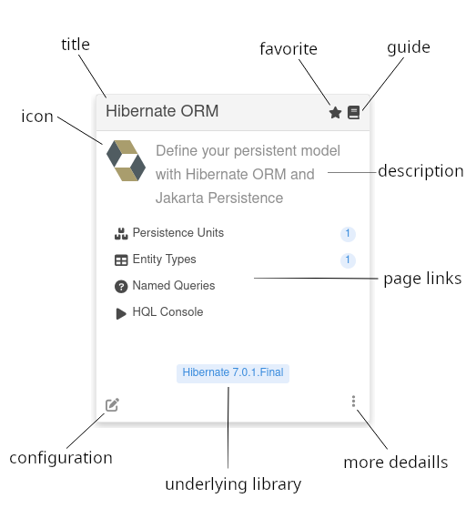
Each card may include the following elements:
| Element | Descrição |
|---|---|
Logo (optional) |
An optional logo representing the extension or its domain |
Title |
The name of the extension as recognized in the Dev UI. |
Favorite |
Marks the card as a favorite. Favorited cards are always displayed first in the Extensions view for easier access. |
Guide (optional) |
Links to the online Quarkus guide for the extension (if available). |
Description |
A short explanation of what the extension does or enables. |
Page Links (optional) |
Interactive entries that navigate to custom pages contributed by the extension. A page link can also optionally contain a label that we discuss later. |
Configuration |
A shortcut to the configuration editor filtered to settings relevant to this extension. |
Underlying Library (optional) |
Shows the version of the main library powering the extension (if any). |
More Details |
Opens a dialog with all information |
| Clicking a page link inside a card navigates to a dedicated UI page for that feature. These pages can be bookmarked into the menu for quick access. |
Extensions are free to customize their cards and add interactive behaviors based on what they provide at runtime.
Settings
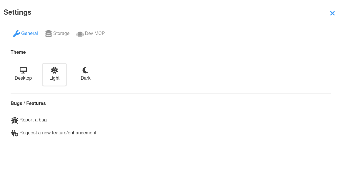
The settings page is a dialog that contains settings for Dev UI:
-
Theme (Change between Desktop/Light/Dark
-
Locale (Change to another supported language/locale)
-
Bugs / Feature requests
-
Storage (Manage local browser storage used in Dev UI)
-
Dev MCP (Enable your Dev Mode to expose a MCP Server)
-
… and more… (Other extensions might add to this)
Guide for Extension Developers
Quarkus extensions can enhance the developer experience by contributing to the Dev UI. The rest of this guide outlines how to integrate your extension into the Dev UI, covering metadata configuration, adding pages to the card, menu, and footer, and best practices for dynamic content.
quarkus-extension.yaml
To have your extension appear in the Dev UI, ensure the quarkus-extension.yaml file is present in the src/main/resources/META-INF directory of your extension’s runtime module. This file provides metadata that the Dev UI uses to generate the extension card.
Exemplo:
name: "Hibernate ORM"
description: "Define your persistent model with Hibernate ORM and Jakarta Persistence"
guide: "https://quarkus.io/guides/hibernate-orm"
metadata:
  categories:
    - "data"
  config:
    - "quarkus.hibernate-orm"
Key fields:
-
name: Displayed as the extension title in the Dev UI card. -
description: Shown as the card’s summary. -
guide: URL to the extension’s guide; used to render the guide icon on the card. -
metadata.config: Filters configuration keys shown when clicking "Configuration" on the card.
Adding Pages to the Dev UI
Your extension needs to have the following dependency in it’s deployment module:
<dependency>
    <groupId>io.quarkus</groupId>
    <artifactId>quarkus-devui-deployment-spi</artifactId>
</dependency>
This can be transitively or directly and is only needed in deployment module. This gives your processor access to the relative Build Items.
Extensions can contribute interactive pages to the Dev UI in the following areas:
-
Card: Add links to pages directly on the extension card.
-
Footer: Add tabs to the footer for logs or other runtime information.
-
Menu: Add pages to the Dev UI’s left-hand menu.
-
Settings: Add a tab to the settings dialog
-
Unlisted: Pages that are not listed anywhere above, but are added to the router and can be linked to.
Card
The most common way to contribute to Dev UI is via Pages from your extension card in the Extension page.
To add links to your extension’s card, produce a CardPageBuildItem in a @BuildStep:
    @BuildStep(onlyIf = IsLocalDevelopment.class) (1)
    void createJokesPageOnCard(BuildProducer<CardPageBuildItem> cardsProducer) {

        CardPageBuildItem cardPageBuildItem = new CardPageBuildItem(); (2)
        cardPageBuildItem.setLogo("clown.svg", "clown.svg"); (3)

        cardPageBuildItem.addPage(Page.webComponentPageBuilder() (4)
                .title("Joke List") (5)
                .icon("font-awesome-solid:cubes") (6)
                .componentLink("qwc-jokes-list.js")); (7)

        cardsProducer.produce(cardPageBuildItem);
}| 1 | Always make sure that this build step is only run when in local dev mode. |
| 2 | To add anything on the card, you must return/produce a CardPageBuildItem. |
| 3 | You can optionally add a logo (dark and light mode) in deployment/src/main/resources/dev-ui/. |
| 4 | To add a link on the card, you can use the addPage method, as all links go to a "page". Page has some builders to assist with building a page. The most common one is the webComponentPageBuilder - but we will discuss some others later. |
| 5 | You can (optionally) add the title, else it will be derived from the component link. |
| 6 | You can add an icon. All free font-awesome icons are available. |
| 7 | Add the link to the web component source (js) file in deployment/src/main/resources/dev-ui/. This has to take the format of qwc-extensionname-pagename.js |
Later we will discuss how to create this web component page.
|
Note about icons
If you find your icon at Font awesome, you can map as follow: Example <i class="fa-solid fa-house"></i> will map to font-awesome-solid:house, so fa becomes font-awesome and for the icon name, remove the fa-.
|
Optional: Library Version
You can add an underlying library badge on the card. This is useful for cases where the extension is exposing a well known library. As example, the quarkus-hibernate-orm extension provides access to Hibernate. Showing the underlying Hibernate details could be useful information for the user:
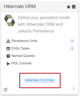
This can be done using the addLibraryVersion method:
cardPageBuildItem.addLibraryVersion("org.hibernate.orm", "hibernate-core", "Hibernate", "https://hibernate.org/orm/");You provide the groupId and artifactId (so that we can look up the version) and a Name and optionally a url.
Optional: Build Time Data
You can pass data gathered during build to the Page (js):
cardPageBuildItem.addBuildTimeData("jokes", jokesBuildItem.getJokes());You can add multiple of these key-value pairs for all the data you know at build time that you need on the page.
The key will be scoped automatically, so you do not have to prefix any namespace. Later we will discuss how to access this data in the webcomponent (page).
Optional: Labels
You can add an optional label to the link in the card using one of the builder methods on the page builder. These labels can be
-
static (known at build time)
.staticLabel("staticLabelValue") -
dynamic (loaded at runtime)
.dynamicLabelJsonRPCMethodName("yourJsonRPCMethodName") -
streaming (continuously streaming updated values at runtime)
.streamingLabelJsonRPCMethodName("yourJsonRPCMethodName")
For dynamic and streaming labels, the method name is the name of the JsonRPC method, that we will discuss later.
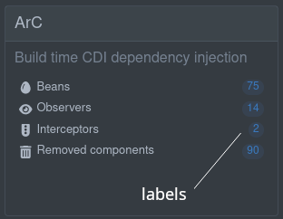
Footer
Apart from adding a card and a page, extensions can add a tab to the footer. This is useful for things that are happening continuously. A page will disconnect from the DOM (and maybe the backend) when navigating away from that page (or webcomponent), and a log in the footer will be permanently connected to the DOM, as it’s always part of the view (or app)
There are 2 ways to add things to the footer. There easiest is to just expose the log in a BuildItem. Here we expect either a supplier (function) that return a Flow.Publisher<String> or a RuntimeValue<SubmissionPublisher<String>>:
@BuildStep(onlyIf = { IsLocalDevelopment.class }) (1)
public void createFooterLog(BuildProducer<FooterLogBuildItem> footerLogProducer){
    footerLogProducer.produce(new FooterLogBuildItem("My Extension Log", () -> {(2)
        return createLogPublisher();(3)
    }));
}| 1 | Always make sure that this build step is only run when in local dev mode. |
| 2 | You must return/produce a FooterLogBuildItem. |
| 3 | Here return a Flow.Publisher<String> that will stream the log |
The RuntimeValue is useful if the log is only available at runtime. If you can get the log in the deployment module you can use the supplier.
Or you can take full control of the UI and produce a FooterPageBuildItem and provide a custom web component in a js file:
    @BuildStep(onlyIf = IsLocalDevelopment.class)(1)
    void createJokesLog(BuildProducer<FooterPageBuildItem> footerProducer) {

            FooterPageBuildItem footerPageBuildItem = new FooterPageBuildItem();(2)

            footerPageBuildItem.addPage(Page.webComponentPageBuilder()(3)
                    .title("Joke Log")(4)
                    .icon("font-awesome-regular:face-grin-tongue-wink")(5)
                    .componentLink("qwc-jokes-log.js"));(6)

            footerProducer.produce(footerPageBuildItem);
}| 1 | Always make sure that this build step is only run when in local dev mode. |
| 2 | To add anything on the footer, you must return/produce a FooterPageBuildItem. |
| 3 | To add a tab in the footer, you can use the addPage method, as all tabs renders a "page". Page has some builders to assist with building a page. The most common one is the webComponentPageBuilder - but we will discuss some others later. |
| 4 | You can (optionally) add the title, else it will be derived from the component link. |
| 5 | You can add an icon. All free font-awesome icons are available. |
| 6 | Add the link to the web component source (js) file in deployment/src/main/resources/dev-ui/. This has to take the format of qwc-extensionname-pagename.js |
Optional: Build Time Data
You can pass data gathered during build to the Page (js):
footerPageBuildItem.addBuildTimeData("jokes", jokesBuildItem.getJokes());You can add multiple of these key-value pairs for all the data you know at build time that you need on the page.
The key will be scoped automatically, so you do not have to prefix any namespace. Later we will discuss how to access this data in the webcomponent (page).
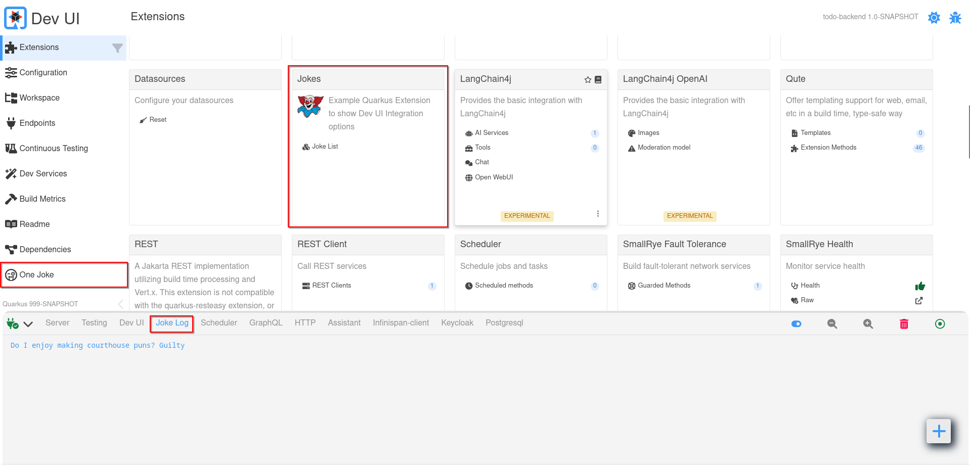
Menu
To add a page to the Dev UI menu, produce a MenuPageBuildItem:
    @BuildStep(onlyIf = IsLocalDevelopment.class) (1)
    void createJokesMenu(BuildProducer<MenuPageBuildItem> menuProducer) {

        MenuPageBuildItem menuPageBuildItem = new MenuPageBuildItem();  (2)

        menuPageBuildItem.addPage(Page.webComponentPageBuilder() (3)
                .title("One Joke") (4)
                .icon("font-awesome-regular:face-grin-tongue-wink") (5)
                .componentLink("qwc-jokes-menu.js")); (6)

        menuProducer.produce(menuPageBuildItem);
    }
}| 1 | Always make sure that this build step is only run when in local dev mode. |
| 2 | To add anything on the menu, you must return/produce a MenuPageBuildItem. |
| 3 | To add a link in the menu, you can use the addPage method, as all links go to a "page". Page has some builders to assist with building a page. The most common one is the webComponentPageBuilder - but we will discuss some others later. |
| 4 | You can (optionally) add the title, else it will be derived from the component link. |
| 5 | You can add an icon. All free font-awesome icons are available. |
| 6 | Add the link to the web component source (js) file in deployment/src/main/resources/dev-ui/. This has to take the format of qwc-extensionname-pagename.js |
This page will appear alongside built-in menu items like "Configuration" or "Workspace."
Optional: Build Time Data
You can pass data gathered during build to the Page (js):
menuPageBuildItem.addBuildTimeData("jokes", jokesBuildItem.getJokes());You can add multiple of these key-value pairs for all the data you know at build time that you need on the page.
The key will be scoped automatically, so you do not have to prefix any namespace. Later we will discuss how to access this data in the webcomponent (page).
Settings
To add a tab to the Dev UI settings dialog, produce a SettingPageBuildItem:
    @BuildStep(onlyIf = IsLocalDevelopment.class) (1)
    void createMCPSettingsTab(BuildProducer<SettingPageBuildItem> settingPageProducer) {

        SettingPageBuildItem mcpSettingTab = new SettingPageBuildItem();(2)

        mcpSettingTab.addPage(Page.webComponentPageBuilder() (3)
                .title("Dev MCP")(4)
                .icon("font-awesome-solid:robot") (5)
                .componentLink("qwc-dev-mcp-setting.js")); (6)
        settingPageProducer.produce(mcpSettingTab);
    }
}| 1 | Always make sure that this build step is only run when in local dev mode. |
| 2 | To add anything on the settings tab, you must return/produce a SettingPageBuildItem. |
| 3 | To add a tab in the setting dialog, you can use the addPage method. |
| 4 | You can (optionally) add the title, else it will be derived from the component link. |
| 5 | You can add an icon. All free font-awesome icons are available. |
| 6 | Add the link to the web component source (js) file in deployment/src/main/resources/dev-ui/. This has to take the format of qwc-extensionname-pagename.js |
This page will be loaded as the content for that tab in the settings dialog
Unlisted Page
Lastly, you can add pages that is not listed anywhere, but added to the Router, and can be navigated to. This is useful if you are building very complex pages that navigates to more pages.
To do this, produce a UnlistedPageBuildItem:
    @BuildStep(onlyIf = IsLocalDevelopment.class) (1)
    void createMCPUnlistedPages(BuildProducer<UnlistedPageBuildItem> unlistedPageProducer) {

        UnlistedPageBuildItem mcpOtherPages = new UnlistedPageBuildItem(); (2)

        mcpOtherPages.addPage(Page.webComponentPageBuilder() (3)
                .title("Tools") (4)
                .icon("font-awesome-solid:screwdriver-wrench") (5)
                .componentLink("qwc-dev-mcp-tools.js"));  (6)
        unlistedPageProducer.produce(mcpOtherPages);
    }
}| 1 | Always make sure that this build step is only run when in local dev mode. |
| 2 | To add an unlisted page, you must return/produce a UnlistedPageBuildItem. |
| 3 | Use the addPage method. |
| 4 | You can (optionally) add the title, else it will be derived from the component link. |
| 5 | You can add an icon. All free font-awesome icons are available. |
| 6 | Add the link to the web component source (js) file in deployment/src/main/resources/dev-ui/. This has to take the format of qwc-extensionname-pagename.js |
This page will be registered to the Router and can be navigated to by a normal link or using the Router:
import { RouterController } from 'router-controller'; (1)

// ...

routerController = new RouterController(this); (2)

// ...

let unlistedPages = this.routerController.getPagesForCurrentNamespace(); (3)
// or if you not in your own space
// let unlistedPages = this.routerController.getPagesForNamespace("your namespace"); (4)

// ... loop over page
this.routerController.go(page); (5)| 1 | Import the RouterController |
| 2 | Create a new instance passing in this to scope it to your namespace |
| 3 | Get all pages of your namespace |
| 4 | Or if you are on another page (not one of yours) you can get the pages for your namespace |
| 5 | Then you can loop over the pages and build the links/buttons. To actions the navigation your use the go method |
Building Web Components
Dev UI uses Lit to make building these web components easier. You can read more about Web Components and Lit:
Most of the JavaScript code in Dev UI is written using Lit, so look for the available operations in the Lit documentation. For instance, for each cycle can be done like this:
render() {
  return html`
    <ul>
      ${this.colors.map((color) =>
        html`<li style="color: ${color}">${color}</li>`
      )}
    </ul>
  `;
}
Basic structure of a Web component page
A Web component page is just a JavaScript Class that creates a new HTML Element:
import { LitElement, html, css} from 'lit'; (1)
import { jokes } from 'build-time-data'; (2)

export class QwcJokesList extends LitElement { (3)

    static styles = css` (4)
        .buttonBar {
            display: flex;
            justify-content: space-between;
            gap: 10px;
            align-items: center;
            width: 90%;
            color: var(--lumo-primary-text-color); (5)
        }

        .buttonBar .button {
            width: 100%;
        }
        `;

    static properties = {
        _jokes: {state: true},
        _numberOfJokes: {state: true},
        _message: {state: true},
        _isStreaming: {state: true} (6)
    };

    constructor() { (7)
        super();
        this._jokes = [];
        this._numberOfJokes = 0;
        this._isStreaming = false;
    }

    connectedCallback() { (8)
        super.connectedCallback();
        jokes.forEach((joke) =>{
            var item = this._toJokeItem(joke);
            this._jokes.push(item);
        });
        this._numberOfJokes = this._jokes.length;
    }

    disconnectedCallback() { (9)
        if(this._isStreaming){
            this._observer.cancel();
        }
        super.disconnectedCallback()
    }

    render() { (10)
         return html`<h3>Here are ${this._numberOfJokes} jokes</h3> (11)
            <vaadin-message-list .items="${this._jokes}"></vaadin-message-list>

            ${this._renderLoadingMessage()}
            <div class="buttonBar">
                <vaadin-button class="button" theme="success" @click=${() => this._fetchMoreJokes()}>
                    <vaadin-icon icon="font-awesome-solid:comment"></vaadin-icon> Tell me more jokes
                </vaadin-button>
                <vaadin-checkbox class="button" label="Stream new jokes continuously" @input=${(e) =>this._startStopStreaming(e)}></vaadin-checkbox>
            </div>
            `;
    }

    // ... more private methods
}
customElements.define('qwc-jokes-list', QwcJokesList); (12)| 1 | You can import Classes and/or functions from other libraries.
In this case, we use the LitElement class and html & css functions from Lit |
| 2 | Build time data as defined in the Build step and can be imported using the key and always from build-time-data. All keys added in your Build step will be available. |
| 3 | The component should be named in the following format: Qwc (stands for Quarkus Web Component), then Extension Name, then Page Title, all concatenated with Camel Case. This will also match the file name format as described earlier. The component should also extend LitComponent. |
| 4 | CSS styles can be added using the css function, and these styles only apply to your component. |
| 5 | Styles can reference globally defined CSS variables to make sure your page renders correctly, especially when switching between light and dark mode. You can find all CSS variables in the Vaadin documentation (Color, Sizing and Spacing, etc.) |
| 6 | Properties can be added. Use _ in front of a property if that property is private. Properties are usually injected in the HTML template, and can be defined as having state, meaning that if that property changes, the component (or part of it) should re-render. In this case, the jokes are Build time data that we gathered while building. |
| 7 | Constructors (optional) should always call super first and then set the default values for the properties. |
| 8 | connectedCallback is a method from Lit that gets called when this component is connected to the DOM. This is a good place to do 'page load' type things, like fetching data from the backend (we will discuss this later) |
| 9 | disconnectedCallback is a method from Lit that gets called when this component is disconnected from the DOM. This is a good place to do any clean up. |
| 10 | render is a method from Lit that will be called to render the page. In this method, you return the markup of the page you want. |
| 11 | You can use the html function from Lit, which gives you a template language to output the HTML you want. Once the template is created, you must only set or change the properties to re-render the page content. Read more about Lit html |
| 12 | You must always register your Web component as a custom element, with a unique tag. Here, the tag will follow the same format as the filename (qwc dash extension name dash page title ); |
Hot reload
You can update a screen automatically when a hot reload happens. To do this, replace the LitElement that your Webcomponent extends with QwcHotReloadElement.
QwcHotReloadElement extends LitElement, so your component is still a Lit Element.
When extending a QwcHotReloadElement, you have to use the hotReload method. (You must also still provide the render method from Lit)
import { QwcHotReloadElement, html, css} from 'qwc-hot-reload-element';

// ...

export class QwcMyExtensionPage extends QwcHotReloadElement {

    render(){
        // ...
    }

    hotReload(){
        // ..
    }

}
Add i18n to your pages
Quarkus Dev UI supports full internationalization (i18n). To enable this in your extension, you must externalize all user-visible text into translation files.
All translation files must be placed under:
<extension>/deployment/src/main/resources/dev-ui/i18n/
Translation file layout
Each translation file is a plain JavaScript module following one of these naming patterns:
-
languagecode.js -
languagecode-COUNTRYCODE.js
The base language file contains translations common to all dialects. A country-specific file contains only the keys that differ from the base.
For example, English:
-
en.js— base English -
en-US.js— American English (only overrides) -
en-GB.js— British English (only overrides)
French follows the same pattern:
-
fr.js— base French -
fr-FR.js— France-specific -
fr-CA.js— Canada-specific
A list of locale codes can be found here: https://simplelocalize.io/data/locales/
Quarkus Dev UI defaults to English. If the user’s browser locale is supported, that locale becomes the active default. Users may also manually change the locale from the Dev UI settings dialog.
Translation file format
Each translation file must export a constant named templates containing key–value pairs:
export const templates = {
    'myextension-some-key': 'Some translated value'
};
All keys must follow this naming convention:
<extensionArtifactId>-<id>
where <extensionArtifactId> is taken from the <artifactId> of your extension’s runtime module.
Example (Agroal):
<artifactId>quarkus-agroal</artifactId>All translation keys must therefore start with:
quarkus-agroal-
Required keys
-
Metadata
To translate the extension description (taken from the <description> element of your runtime POM), define:
<extensionArtifactId>-meta-description
Exemplo:
'quarkus-agroal-meta-description': 'JDBC Datasources and connection pooling'-
Page titles
Each Dev UI page (created with CardPageBuildItem) needs a translation key for its title.
For a page titled "Database view" in Agroal:
cardPageBuildItem.addPage(Page.webComponentPageBuilder()
        .icon("font-awesome-solid:database")
        .title("Database view")
        .componentLink("qwc-agroal-datasource.js"));
The translation key becomes quarkus-agroal-database_view.
(for the title, spaces replaced with underscores, lower-case.)
Example entry:
'quarkus-agroal-database_view': 'Database view'-
General text
All other user-visible strings in your JS code should also be externalized.
Exemplo:
import { str } from '@lit/localize';

export const templates = {
    // Metadata
    'quarkus-agroal-meta-description': 'JDBC Datasources and connection pooling',

    // Pages
    'quarkus-agroal-database_view': 'Database view',

    // General
    'quarkus-agroal-fetching-data-sources': 'Fetching data sources...'
};
Updating your JavaScript pages
To use translations inside your Lit components, update your code as follows.
-
Import the localization helpers
import { msg, str, updateWhenLocaleChanges } from 'localization';-
msg: lookup a translation key
-
str: create dynamic strings with variables
-
updateWhenLocaleChanges: tells Lit to re-render automatically when language changes
-
Register for locale changes
-
Add the following in your constructor:
constructor() {
    super();
    updateWhenLocaleChanges(this);
}-
Replace inline text with translation lookups
Before:
return this._renderProgressBar('Fetching data sources...');After:
return this._renderProgressBar(
    msg('Fetching data sources...', { id: 'quarkus-agroal-fetching-data-sources' })
);
If the key does not exist in the current locale, the fallback text ('Fetching data sources…') is used automatically.
Exemplos:
// en.js
'quarkus-agroal-fetching-data-sources': 'Fetching data sources...'

// fr.js
'quarkus-agroal-fetching-data-sources': 'Récupération des sources de données…'
1.1 Using variables inside translations
For dynamic messages, wrap the default string in str:
} catch (error) {
    notifier.showErrorMessage(
        msg(str`Failed to save file: ${error}`, { id: 'quarkus-agroal-file-save-failed' })
    );
}
In translation files, use positional variables (${0}, ${1}, …):
// en.js
'quarkus-agroal-file-save-failed': str`Failed to save file: ${0}`,

// fr.js
'quarkus-agroal-file-save-failed': str`Échec de l’enregistrement du fichier : ${0}`,
UI Components
Vaadin Web Components
Vaadin Web Components: Dev UI makes extensive usage of Vaadin web components as UI Building blocks.
Qomponent
Qomponent: A few custom build components that can be used.
Currently the following UI component are available:
-
qui-dot - Render dot files.
-
qui-code-block - Render code. (See below Code block section)
-
qui-directory-tree - Render a directory tree (like in the workspace).
-
qui-alert - Show an alert.
-
qui-card - Card component.
-
qui-switch - Switch button.
-
qui-badge - Badge component.
Code block
Creates a code block (containing marked up code). This could also be made editable. This component uses the above mentioned code block from qomponent, that is built with code-mirror, but adds the automatic theme state when switching themes.
Code can be provided remotely (src) or as a property (content) or as a slotted value (example below).
import 'qui-themed-code-block';<qui-themed-code-block mode="properties">
<slot>
foo = bar
</slot>
</qui-themed-code-block>Currently the following modes are supported:
-
xml
-
javascript
-
php
-
cpp
-
go
-
rust
-
python
-
json
-
java
-
sql
-
yaml
-
html
-
css
-
sass
-
less
-
markdown
-
asciidoc
-
properties
-
asciiArmor
-
powerShell
-
shell
-
protobuf
-
dockerFile
-
diff
See the @qomponent/qui-code-block for more details.
IDE link
Creates a link to a resource (like a Java source file) that can be opened in the user’s IDE (if we could detect the IDE).
import 'qui-ide-link';<qui-ide-link title='Source full class name'
class='text-source'
fileName='${sourceClassNameFull}'
lineNumber='${sourceLineNumber}'>[${sourceClassNameFull}]</qui-ide-link>;Using internal controllers
Some internal controllers are available to make certain things easier:
-
Notifier
-
Storage
-
Log
-
Router
Notifier
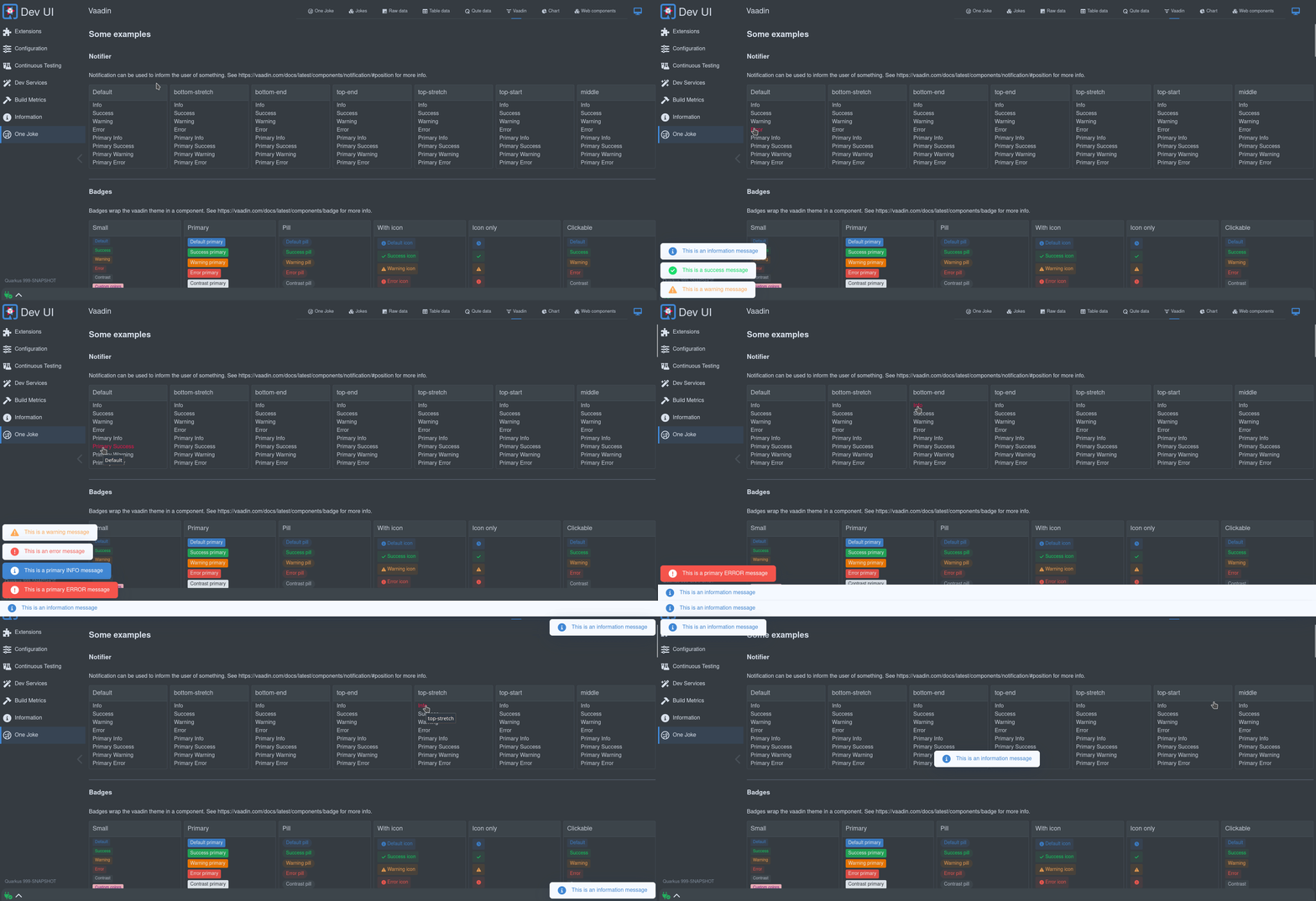
This is an easy way to show a toast message. The toast can be placed on the screen (default left bottom) and can have a level (Info, Success, Warning, Error). Any of the levels can also be primary, which will create a more prominent toast message.
See the source of this controller here.
Example usage:
import { notifier } from 'notifier';<a @click=${() => this._info()}>Info</a>;_info(position = null){
notifier.showInfoMessage("This is an information message", position);
}You can find all the valid positions here.
Storage
An easy way to access the local storage in a safe way. This will store values in the local storage, which is scoped for your extension. This way, you do not have to worry that you might clash with another extension.
Local storage is useful to remember user preferences or state. For example, the footer remembers the state (open/close) and the size when open of the bottom drawer.
import { StorageController } from 'storage-controller';

// ...

storageControl = new StorageController(this); // Passing in this will scope the storage to your extension

// ...

const storedHeight = this.storageControl.get("height"); // Get some value

// ...

this.storageControl.set('height', 123); // Set some valPer Application
You can narrow the score of the storage further by the current application:
storageControl = new StorageController(this, true); // Passing in true will scope per applicationStorage Setting
Users can have a raw view on the storage in the settings page:
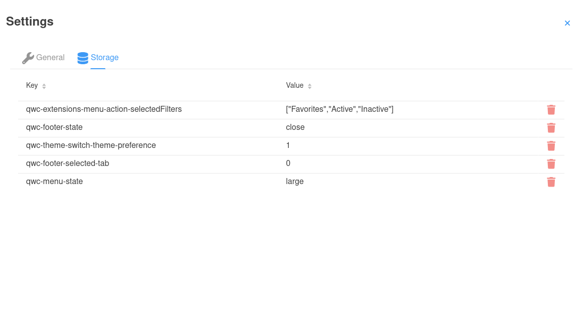
Because users can clean/revert to default in this screen by deleting the storage item, an extension might want to react on this:
connectedCallback() {
        super.connectedCallback();
        window.addEventListener('storage-changed', this._storageChange); // Listen for storage changes
}

disconnectedCallback() {
        window.removeEventListener('storage-changed', this._storageChange); // Clean up
        super.disconnectedCallback();
}

_storageChange = (e) => {
    if(e.detail.method === "remove" && e.detail.key.startsWith("qwc-myextensionname-")){ // Only care about remove and your extension
        // React on storage removal
    }
}
Log
The log controller is used to add control buttons to a (footer) log. See Footer.

import { LogController } from 'log-controller';

// ...

logControl = new LogController(this); // Passing in this will scope the control to your extension

// ...
this.logControl
                .addToggle("On/off switch", true, (e) => {
                    this._toggleOnOffClicked(e);
                }).addItem("Log levels", "font-awesome-solid:layer-group", "var(--lumo-tertiary-text-color)", (e) => {
                    this._logLevels();
                }).addItem("Columns", "font-awesome-solid:table-columns", "var(--lumo-tertiary-text-color)", (e) => {
                    this._columns();
                }).addItem("Zoom out", "font-awesome-solid:magnifying-glass-minus", "var(--lumo-tertiary-text-color)", (e) => {
                    this._zoomOut();
                }).addItem("Zoom in", "font-awesome-solid:magnifying-glass-plus", "var(--lumo-tertiary-text-color)", (e) => {
                    this._zoomIn();
                }).addItem("Clear", "font-awesome-solid:trash-can", "var(--lumo-error-color)", (e) => {
                    this._clearLog();
                }).addFollow("Follow log", true , (e) => {
                    this._toggleFollowLog(e);
}).done();Router
The router is mostly used internally. This uses Vaadin Router under the covers to route URLs to the correct page/section within the SPA. It will update the navigation and allow history (back button). This also creates the sub-menu available on extensions that have multiple pages.
See the controller for some methods that might be useful.
Global State
The properties on a Web component page is scope for that page/webcomponent. There is also a few global states available that might be useful in your component. Dev UI uses LitState for this. LitState automatically re-renders your LitElement components, when a shared app state variable they use changes. It’s like LitElement’s properties, but then shared over multiple components.
Dev UI has the following build-in state:
-
Connection
-
Theme
-
Assistant
-
Interface do usuário do desenvolvedor
Connection State
This will give you the connection state to the backend. Dev UI is connected to the backend with a Web Socket. The UI might loose connection to the backend in certain cases, example a Hot reload is in progress or the user actually stopped the server.
To use this state in your page:
import { observeState } from 'lit-element-state'; (1)
import { connectionState } from 'connection-state'; (2)

export class QwcExtensionPage extends observeState(LitElement) { (3)| 1 | import observeState from the LitState library. |
| 2 | import the state you are interested in, in this case connection state. |
| 3 | Wrap the LitElement in observerState |
Now you can access the connection state anywhere in your page, and when that state changes it will act exactly the same as a local state - re-render the relevant parts of the page:
render() {
    return html`<vaadin-icon title="${connectionState.current.message}" style="color:${connectionState.current.color}" icon="font-awesome-solid:${connectionState.current.icon}"></vaadin-icon>`;
    }
You can see all the properties of connection state here
Theme State
This will give you access to the current theme, that the user can change at any time.
To use this state in your page:
import { observeState } from 'lit-element-state'; (1)
import { themeState } from 'theme-state'; (2)

export class QwcExtensionPage extends observeState(LitElement) { (3)| 1 | import observeState from the LitState library. |
| 2 | import the state you are interested in, in this case theme state. |
| 3 | Wrap the LitElement in observerState |
Now you can access the theme state anywhere in your page, and when that state changes it will act exactly the same as a local state - re-render the relevant parts of the page:
render() {
    return html`<div class="codeBlock">
                        <qui-code-block
                            mode='json'
                            content='${json}'
                            theme='${themeState.theme.name}'
                            showLineNumbers>
                        </qui-code-block>`;
    }
You can see all the properties of theme state here
Assistant State
This state contains information on the Quarkus Assistant, if it’s available and if it’s configured and ready to be used. This is useful if you extension provide assistant features and you need to know the state of the assistant.
To use this state in your page:
import { observeState } from 'lit-element-state'; (1)
import { assistantState } from 'assistant-state'; (2)

export class QwcExtensionPage extends observeState(LitElement) { (3)| 1 | import observeState from the LitState library. |
| 2 | import the state you are interested in, in this case assistant state. |
| 3 | Wrap the LitElement in observerState |
Now you can access the assistant state anywhere in your page, and when that state changes it will act exactly the same as a local state - re-render the relevant parts of the page:
render() {
    if(assistantState.current.isConfigured){
        return html`<div class="assistantfeature">
                        <span> Magic happens here</span>
                    </div>`;
    }
}
You can see all the properties of assistant state here
Dev UI State
This state is a general state that contains global properties used in Dev UI, and it’s mostly use internally. It works exactly the same as any of the states discussed before.
A lot of the properties in this state is really build time data that auto reload when a hot-reload happens.
You can see all the properties of dev ui state here
Other ways to create pages
As mentioned, there are some other ways to create pages in Dev UI (other than using Web Components).
External links
These are links that reference other (external from Dev UI) data. This data can be HTML pages, text, or other data.
A good example of this is the SmallRye OpenAPI extension that contains links to the generated OpenAPI schema in both JSON and YAML format, and a link to Swagger UI:
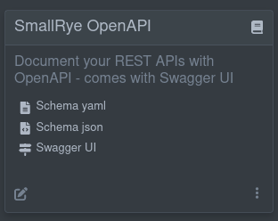
The links to these external references are known at build time. So to get links like this on your card, you add the following Build Step in your extension:
@BuildStep(onlyIf = IsLocalDevelopment.class)(1)
public CardPageBuildItem pages(NonApplicationRootPathBuildItem nonApplicationRootPathBuildItem) {

    CardPageBuildItem cardPageBuildItem = new CardPageBuildItem(); (2)

    cardPageBuildItem.addPage(Page.externalPageBuilder("Schema yaml") (3)
            .url(nonApplicationRootPathBuildItem.resolvePath("openapi")) (4)
            .isYamlContent() (5)
            .icon("font-awesome-solid:file-lines")); (6)

    cardPageBuildItem.addPage(Page.externalPageBuilder("Schema json")
            .url(nonApplicationRootPathBuildItem.resolvePath("openapi") + "?format=json")
            .isJsonContent()
            .icon("font-awesome-solid:file-code"));

    cardPageBuildItem.addPage(Page.externalPageBuilder("Swagger UI")
            .url(nonApplicationRootPathBuildItem.resolvePath("swagger-ui"))
            .isHtmlContent()
            .icon("font-awesome-solid:signs-post"));

    return cardPageBuildItem;
}| 1 | Always make sure that this build step is only run when in local dev mode |
| 2 | To add anything on the card, you must return/produce a CardPageBuildItem. |
| 3 | To add a link, you can use the addPage method, as all links go to a "page". Page has some builders to assist with building a page. For external links, use the externalPageBuilder. |
| 4 | Adding the url of the external link (in this case, we use NonApplicationRootPathBuildItem to create this link, as this link is under the configurable non-application path, default /q). Always use NonApplicationRootPathBuildItem if your link is available under /q. |
| 5 | You can (optionally) hint the content type of the content you are navigating to. If there is no hint, a header call will be made to determine the MediaType; |
| 6 | You can add an icon. All free font-awesome icons are available. |
Embedding external content
By default, even external links will render inside (embedded) in Dev UI. In the case of HTML, the page will be rendered, and any other content will be shown using code-mirror to markup the media type. For example, the OpenAPI schema document in YAML format:
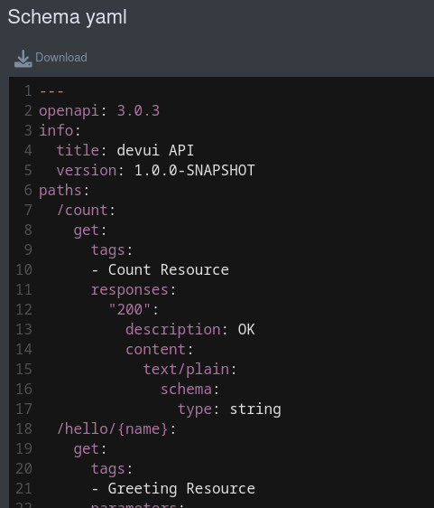
If you do not want to embed the content, you can use the .doNotEmbed() on the Page Builder, this will then open the link in a new tab.
Runtime external links
The example above assumes you know the link to use at build time. There might be cases where you only know this at runtime. In that case, you can use a JsonRPC Method (discussed later) that returns the link to add, and use that when creating the link. Rather than using the .url method on the page builder, use the .dynamicUrlJsonRPCMethodName("yourJsonRPCMethodName").
If the RPC method accepts parameters, you can add these to the method
.dynamicUrlJsonRPCMethodName("yourJsonRPCMethodName", Map.of("parameter-name", "parameter-value)).
The RPC method lookup defaults to the extension namespace. RPC methods from other extension namespaces can be used by prefixing the method name with the namespace : .dynamicUrlJsonRPCMethodName("otherNamespace:jsonRPCMethodName").
For example, the following Page definition will call the devui-dev-services:devServicesConfig JsonRPC method at runtime to get the URL to the dev service named my-dev-service:
cardPageBuildItem.addPage(Page.externalPageBuilder("External Page")
                .dynamicUrlJsonRPCMethodName("devui-dev-services:devServicesConfig", (1)
                    Map.of("name", "my-dev-service", (2)
                            "configKey", "url-config-key"))
.isHtmlContent());| 1 | Use the devServicesConfig RPC method from the namespace devui-dev-services. |
| 2 | Set the parameters needed by the RPC method, name and configKey. |
Raw data pages
If you have some data that is known at build time (build time data) that you want to display, you can use one of the following builders in Page:
Marked-up data
This will display your data in its raw (serialised) JSON value:
cardPageBuildItem.addPage(Page.rawDataPageBuilder("Raw data") (1)
                .icon("font-awesome-brands:js")
.buildTimeDataKey("someKey")); (2)| 1 | Use the rawDataPageBuilder. |
| 2 | Link back to the key used when you added the build time data in addBuildTimeData on the Page BuildItem. |
That will create a link to a page that renders the raw data in JSON:
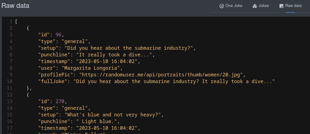
Table data
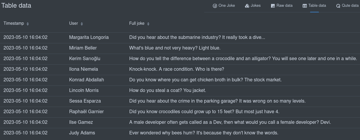
You can also display your Build time data in a table if the structure allows it:
cardPageBuildItem.addPage(Page.tableDataPageBuilder("Table data") (1)
                .icon("font-awesome-solid:table")
                .showColumn("timestamp") (2)
                .showColumn("user") (2)
                .showColumn("fullJoke") (2)
.buildTimeDataKey("someKey")); (3)| 1 | Use the tableDataPageBuilder. |
| 2 | Optionally only show certain fields. |
| 3 | Link back to the key used when you added the build time data in addBuildTimeData on the Page BuildItem. |
That will create a link to a page that renders the data in a table:
Qute data
You can also display your build time data using a qute template. All build time data keys are available to use in the template:
cardPageBuildItem.addPage(Page.quteDataPageBuilder("Qute data") (1)
                .icon("font-awesome-solid:q")
.templateLink("qute-jokes-template.html")); (2)| 1 | Use the quteDataPageBuilder. |
| 2 | Link to the Qute template in /deployment/src/main/resources/dev-ui/. |
Use any Qute template to display the data, for example, qute-jokes-template.html:
<table>
    <thead>
        <tr>
            <th>Timestamp</th>
            <th>User</th>
            <th>Joke</th>
        </tr>
    </thead>
    <tbody>
        {#for joke in jokes} (1)
        <tr>
            <td>{joke.timestamp}</td>
            <td><span><img src="{joke.profilePic}" height="30px"></img> {joke.user}</span></td>
            <td>{joke.fullJoke}</td>
        </tr>
        {/for}
    </tbody>
</table>| 1 | jokes added as a build time data key on the Page Build Item. |
Communicating to the backend
All communication to the backend happens with JsonRPC over web socket. Dev UI makes this easy to use for extension developers, and you do not really need to get into the details of either JsonRPC or Web Sockets.
There are 3 stages to communicate to a backend during runtime (when the user is running their app in dev mode):
-
Executing some method against the runtime classpath
-
Executing some method against the deployment classpath
-
Returning data from some recorded value
JsonRPC against the Runtime classpath
You can fetch or stream runtime data (rather than Build time data discussed earlier) or execute methods against the runtime classpath (as opposed to deployment classpath). There are two parts to getting data during runtime. The Java side in the runtime or runtime-dev module, and then the usage in the web component (that we will discuss later).
In your Runtime or Runtime-dev module, create the JsonRPC Service. This class will default to an application-scoped bean, except if you explicitly scope the bean. All public methods that return something will be made available to call from the Web component Javascript.
The return object in these methods can be:
-
primitives or
String, -
io.vertx.core.json.JsonArray -
io.vertx.core.json.JsonObject -
any other POJO that can be serializable to JSON
All of the above can be blocking (POJO) or nonblocking (@NonBlocking or Uni). Alternatively, data can be streamed using Multi.
(1)
public class JokesJsonRPCService {

    private final BroadcastProcessor<Joke> jokeStream = BroadcastProcessor.create();
    private final BroadcastProcessor<Joke> jokeLog = BroadcastProcessor.create();
    private static int numberOfJokesTold = 10;

    @PostConstruct
    void init() {
        Multi.createFrom().ticks().every(Duration.ofMinutes(1)).subscribe().with((item) -> {
            jokeStream.onNext(getJoke());
        });
    }

    public Multi<Joke> streamJokes() { (2)
        return jokeStream;
    }

    @NonBlocking (3)
    public Joke getJoke() {
        numberOfJokesTold++;
        Joke joke = fetchRandomJoke();
        jokeLog.onNext(joke);
        return joke;
    }

    public Multi<Joke> jokeLog() {
        return jokeLog;
    }

    // Some more private methods
}| 1 | Non-scoped class will default to Application Scope |
| 2 | Data can be streamed with Multi |
| 3 | This example runs nonblocking. We could also return Uni<Joke> |
This code is responsible for making data available to display on the UI.
You must register the JsonPRCService in your processor in the deployment module:
@BuildStep
JsonRPCProvidersBuildItem createJokesJsonRPCService() {(1)
    return new JsonRPCProvidersBuildItem(JokesJsonRPCService.class);(2)
}| 1 | Produce or return a JsonRPCProvidersBuildItem |
| 2 | Define the class in your runtime or runtime-dev module that will contain methods that make data available in the UI |
If you are creating a new runtime-dev module, you must also add the conditional Dev dependency in
the runtime module pom.xml:
<plugin>
    <groupId>io.quarkus</groupId>
    <artifactId>quarkus-extension-maven-plugin</artifactId>
    <configuration>
        <conditionalDevDependencies>
            <artifact>${project.groupId}:${project.artifactId}-dev:${project.version}</artifact>
        </conditionalDevDependencies>
        ...
    </configuration>
</plugin>
JsonRPC against the Deployment classpath
In certain cases you might need to execute methods and/or get data against the deployment classpath. This also happens over JsonRPC communication, but in this case you do not create a JsonRPC Service in the runtime module,
you can just supply the code to be run in a supplier in the deployment module. To do this you will produce a BuildTimeActionBuildItem, example:
    @BuildStep(onlyIf = IsLocalDevelopment.class)
    BuildTimeActionBuildItem createBuildTimeActions() { (1)
        BuildTimeActionBuildItem generateManifestActions = new BuildTimeActionBuildItem(); (2)

        generateManifestActions.actionBuilder()
            .methodName("generateManifests")(3)
            .function(params -> { (4)
                try {
                    List<Manifest> manifests = holder.getManifests();
                    // Avoid relying on databind.
                    Map<String, String> map = new LinkedHashMap<>();
                    for (Manifest manifest : manifests) {
                        map.put(manifest.getName(), manifest.getContent());
                    }
                    return map;
                } catch (Exception e) {
                    throw new RuntimeException(e);
                }
            }).build();

        return generateManifestActions;
}| 1 | Return or use a BuildProducer to create a BuildTimeActionBuildItem |
| 2 | BuildTimeActionBuildItem is automatically scoped with your extension namespace |
| 3 | The method name (that can be called from js in the same way as any json-rpc service) is generateManifests. |
| 4 | Here we add an function that will execute when this action is requested from the UI. If there are any parameters, those will be available in a map (params) |
You can also return a CompletableFuture/CompletionStage as an action, and if you want to stream data you need to use addSubscription (rather than addAction) and return a Flow.Publisher. Here you can not use Uni and Multi as we need to pass data between the deployment and runtime classpaths, so sticking to JDK classes is the safe option.
JsonRPC against a recorded value
Passing recorded data to the UI work the same as the above deployment classpath, except rather than a function, you pass the RuntimeValue (returned from your recorder)
@BuildStep(onlyIf = IsLocalDevelopment.class)
BuildTimeActionBuildItem createBuildTimeActions() {
    BuildTimeActionBuildItem actionBuildItem = new BuildTimeActionBuildItem();
        actionBuildItem.actionBuilder()
                .methodName("getMyRecordedValue")
                .runtime(runtimeValue) (1)
                .build();
    return actionBuildItem;
}| 1 | Set the RuntimeValue as returned from your recorder. |
JsonRPC in the Webcomponent (Page)
You can use the built-in JsonRPC controller to access the any of the methods you defined. Runtime, Deployment and Recorded all works the same way in the WebComponent.
import { JsonRpc } from 'jsonrpc';

// ...

jsonRpc = new JsonRpc(this); // Passing in this will scope the RPC calls to your extension

// ...

connectedCallback() {
    super.connectedCallback();
    this.jsonRpc.getJoke().then(jsonRpcResponse => { (1)
        this._addToJokes(jsonRpcResponse.result); (2)
    });
}| 1 | Note the method getJoke corresponds to the method in your Java Service. This method returns a Promise with the JsonRPC result. |
| 2 | In this case, the result is an object, so we just add it to our list of jokes. This could also be an array if the server returned some collection. |
JsonArray (or any Java collection), either blocking or nonblocking, will return an array; otherwise, a JsonObject will be returned.
You can also pass in parameters in the method being called, for example: (In the Runtime Java code)
public Uni<JsonObject> clear(String name) { (1)
    Optional<Cache> cache = manager.getCache(name);
    if (cache.isPresent()) {
        return cache.get().invalidateAll().map((t) -> getJsonRepresentationForCache(cache.get()));
    } else {
        return Uni.createFrom().item(new JsonObject().put("name", name).put("size", -1));
    }
}| 1 | The clear method takes one parameter called name |
In the Webcomponent (Javascript):
_clear(name) {
    this.jsonRpc.clear({name: name}).then(jsonRpcResponse => { (1)
        this._updateCache(jsonRpcResponse.result)
    });
}| 1 | The name parameter is passed in. |
Streaming data
You can keep a UI screen updated with the latest data by continuously streaming data to the screen. This can be done with Multi (Java side) and Observer (Javascript side)
Java side of streaming data:
public class JokesJsonRPCService {

    private final BroadcastProcessor<Joke> jokeStream = BroadcastProcessor.create();

    @PostConstruct
    void init() {
        Multi.createFrom().ticks().every(Duration.ofHours(4)).subscribe().with((item) -> {
            jokeStream.onNext(getJoke());
        });
    }

    public Multi<Joke> streamJokes() { (1)
        return jokeStream;
    }

    // ...
}| 1 | Return the Multi that will stream jokes |
Javascript side of streaming data:
this._observer = this.jsonRpc.streamJokes().onNext(jsonRpcResponse => { (1)
    this._addToJokes(jsonRpcResponse.result);
    this._numberOfJokes = this._numberOfJokes++;
});

// ...

this._observer.cancel(); (2)| 1 | You can call the method (optionally passing in parameters) and then provide the code that will be called on the next event. |
| 2 | Make sure to keep an instance of the observer to cancel later if needed. |
Workspace
Extensions can contribute actions to items in the workspace.
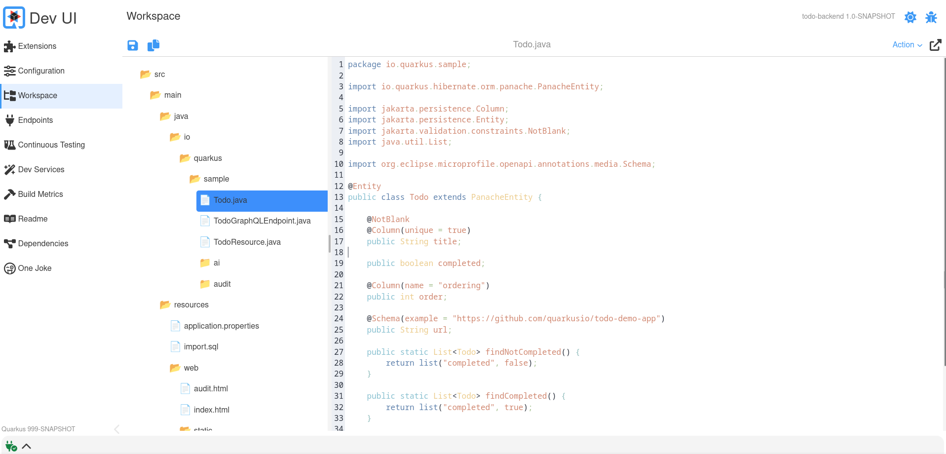
Actions are really a JsonRPC Method that takes a workspace item as input.
To do this you can return/produce a WorkspaceActionBuildItem in your processor:
    @BuildStep(onlyIf = IsLocalDevelopment.class)
    WorkspaceActionBuildItem createWorkspaceActions() {
        ActionBuilder actionBuilder = Action.actionBuilder() (1)
                .label("Joke") (2)
                .function((t) -> { (3)
                    // Here do something with the input and return something
                    String content = t.content;
                    // ....
                    return t;
                })
                .display(Display.split) (4)
                .displayType(DisplayType.markdown) (5)
                .filter(Patterns.ANY_JAVA); (6)

        return new WorkspaceActionBuildItem(actionBuilder);
}| 1 | Use the actionBuilder to create a new Action. |
| 2 | The label is what will be displayed in the action drop down in thw Workspace Page |
| 3 | Here the code that will execute if the user selects this action. You will receive some input (see the Input section below) |
| 4 | How the result should be displayed (see the Display section below) |
| 5 | What the result type would be (see the DisplayType section below) |
| 6 | Optional filter if this action only applies to certain items. Takes a regex as input, and some predefined regexes exisits in the the Patterns class |
Input
The input your function receives is:
-
actionId: The unique (autoscoped) action id
-
name: The item (or file) name
-
path: The full path to that item (or file)
-
content: The content of this item (or file)
-
type: the type (example text/plain)
Display
Here you can set how the response should display in the Workspace page. Options are:
-
nothing: Nothing will be displayed
-
dialog: Content will be displayed in a dialog popup
-
replace: Content will replace the original (input) content
-
split: Content will display in a split screen (left/right)
-
notification: Content will in a notification
DisplayType
Depending on what your action does with the content input, your output might produce the following types:
-
raw: This will be used as is (text)
-
code: This will be rendered in a code editor
-
markdown: This will display interperated markdown
-
html: This will display interperated html
-
image: This will display an image
Advanced: Custom cards
You can customize the card that is being displayed on the extension page if you do not want to use the default built-in card.
To do this, you must provide a Webcomponent that will be loaded in the place of the provided card and register this in the Java Processor:
cardPageBuildItem.setCustomCard("qwc-mycustom-card.js");On the Javascript side, you have access to all the pages (in case you want to create links)
import { pages } from 'build-time-data';And the following properties will be passed in:
-
extensionName
-
description
-
guide
-
namespace
-
logoUrl
static properties = {
    extensionName: {type: String},
    description: {type: String},
    guide: {type: String},
    namespace: {type: String},
    logoUrl: {type: String}
}
Dev UI Log
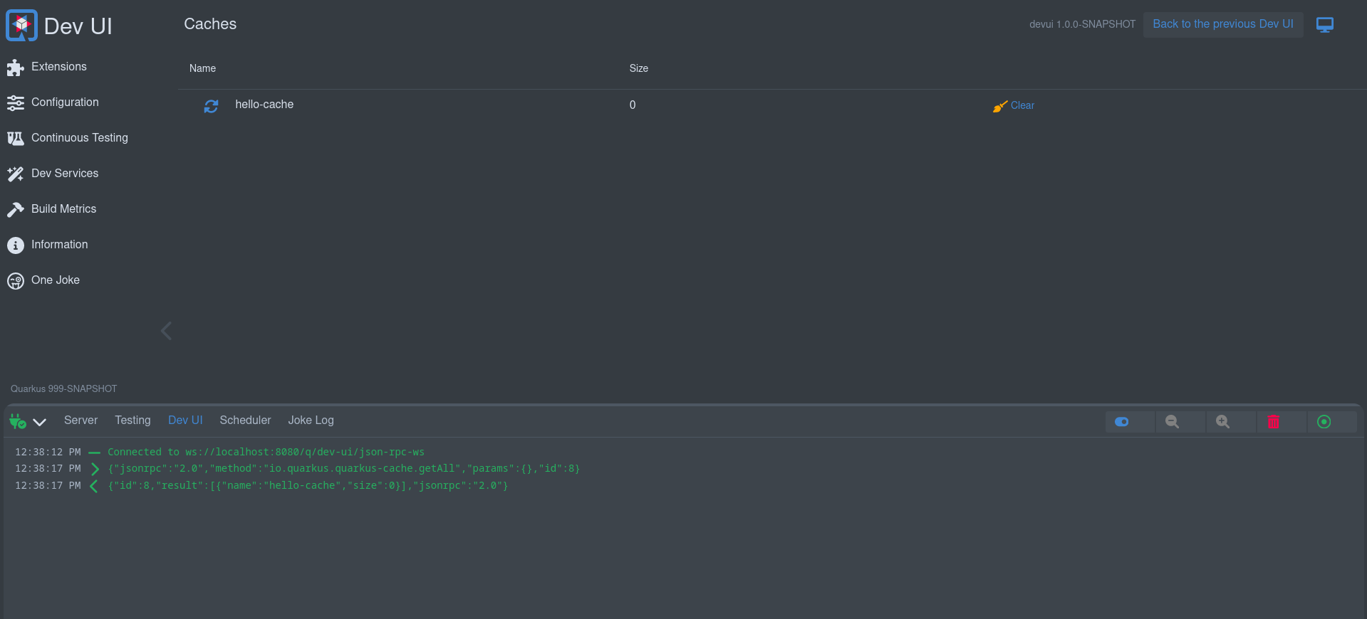
When running a local application using the 999-SNAPSHOT version, the Dev UI will show a Dev UI Log in the footer. This is useful for debugging all JSON RPC messages flowing between the browser and the Quarkus app.
There might be cases where you develop an extension outside of Quarkus core (like Quarkiverse), so your quarkus version is not 999-SNAPSHOT. In that case you can still enable the Dev UI log with this application property: quarkus.dev-ui.show-json-rpc-log=true
Advanced: Headless Components
In rare cases, an extension might need to execute logic even when its main component is not added to the DOM. This is typically useful for setting global state or triggering background tasks without displaying any UI.
To support this, extensions can declare a headless component — a web component with no visual representation that runs automatically on page load.
Declare the headless component in your extension:
CardPageBuildItem cardPageBuildItem = new CardPageBuildItem();
cardPageBuildItem.setHeadlessComponentLink("qwc-chappie-init.js"); (1)| 1 | Set the path to the headless component JavaScript file (relative to the extension resources). |
Then create the component alongside your other Dev UI pages:
import { LitElement } from 'lit';
import { JsonRpc } from 'jsonrpc';
import { assistantState } from 'assistant-state';

/**
 * This load on browser load (headless components) to set the initial assistant state
 */
class QwcChappieInit extends LitElement {

    static properties = {
        namespace: {attribute: true}, (1)
    }

    connectedCallback() {
        super.connectedCallback();
        this._init().then(() => this.remove()); (2)
    }

    async _init() {
        const jsonRpc = new JsonRpc(this.namespace); (3)

        jsonRpc.loadConfiguration().then(jsonRpcResponse => {
            if(jsonRpcResponse.result && jsonRpcResponse.result.name){
                assistantState.ready();
            }else{
                assistantState.available();
            }
        });
    }

    // prevent rendering anything
    createRenderRoot() { (3)
        return this;
    }
}
customElements.define('qwc-chappie-init', QwcChappieInit); (4)| 1 | The namespace attribute will always be provided automatically by Dev UI. |
| 2 | Perform your logic in connectedCallback, then remove the element if no longer needed. |
| 3 | When using JsonRPC, pass in the provided namespace (instead of this, as in normal components). |
| 4 | Your tag definition has to be the filename without the .js |
Testando
You can add tests to your extension that test:
-
Build time data
-
Runtime data via JsonRPC
You must add this to your pom:
<dependency>
    <groupId>io.quarkus</groupId>
    <artifactId>quarkus-devui-test-spi</artifactId>
    <scope>test</scope>
</dependency>
This will give you access to two base classes for creating these tests.
Testing Build time data
If you added Build time data, for example:
cardPageBuildItem.addBuildTimeData("somekey", somevalue);To test that your build time data is generated correctly, you can add a test that extends DevUIBuildTimeDataTest.
public class SomeTest extends DevUIBuildTimeDataTest {

    @RegisterExtension
    static final QuarkusDevModeTest config = new QuarkusDevModeTest().withEmptyApplication();

    public SomeTest() {
        super("my-extension-artifactId");
    }

    @Test
    public void testSomekey() throws Exception {
        JsonNode somekeyResponse = super.getBuildTimeData("somekey");
        Assertions.assertNotNull(somekeyResponse);

        // Check more values on somekeyResponse
    }

}
Testing Runtime data
If you added a JsonRPC Service with runtime data responses, for example:
public boolean updateProperties(String content, String type) {
    // ...
}
To test that updateProperties executes correctly via JsonRPC, you can add a test that extends DevUIJsonRPCTest.
The following dependency might also be required to be added to your pom, if it’s not yet added by other dependencies, otherwise Dev UI will not start during testing:
<dependency>
    <groupId>io.quarkus</groupId>
    <artifactId>quarkus-vertx-http-deployment</artifactId>
    <scope>test</scope>
</dependency>
public class SomeTest extends DevUIJsonRPCTest {
@RegisterExtension
static final QuarkusDevModeTest config = new QuarkusDevModeTest().withEmptyApplication();
public SomeTest() {
super("my-extension-artifactId");
}
@Test
public void testUpdateProperties() throws Exception {
JsonNode updatePropertyResponse = super.executeJsonRPCMethod("updateProperty",
Map.of(
"name", "quarkus.application.name",
"value", "changedByTest"));
Assertions.assertTrue(updatePropertyResponse.asBoolean());
// Get the properties to make sure it is changed
JsonNode allPropertiesResponse = super.executeJsonRPCMethod("getAllValues");
String applicationName = allPropertiesResponse.get("quarkus.application.name").asText();
Assertions.assertEquals("changedByTest", applicationName);
}
}